
Лучшие объективы для портретной и событийной фотографии
Практичный гид по объективам для портретов, свадеб, событий и клиентской съемки с фокусными расстояниями, диафрагмой и crop-сенсорами.
Советы по фотографии
6 минута чтения

Опубликовано 18 июня 2026 г. | 7 минута чтения
Лучший выбор фона для портретной фотографии поддерживает объект, не отвлекая внимания. Начните с чистого света, достаточного разделения, цветов, которые сочетаются с клиентом и гардеробом, простых линий и текстуры, соответствующей настроению. Простая стена может идеально подойти для одного портрета, а детальная локация — для другого. Правильный фон – тот, который помогает зрителю понять человека в кадре.
 Яркий фон для портрета может быть простым, текстурированным, в помещении или на улице, при условии, что он удерживает внимание на объекте.
Чистый фон полезен, когда лицо, выражение лица, стиль или продукт сеанса должны быть основной историей. Контекстуальный фон полезен, когда место добавляет смысл: музыкант на репетиции, основатель студии, пара в значимом районе или свадебный портрет, передающий атмосферу места проведения.
Тип фона | Лучшее для | Что посмотреть |
|---|---|---|
Простая стена или бесшовный фон | Снимки в голову, портреты брендов, основы портфолио, чистые редакционные рамки. | Избегайте плоского света, неуклюжих теней и цветов, которые не сочетаются с гардеробом или оттенком кожи. |
Текстурированная стена или ткань | Креативные портреты, личный брендинг, мода, музыканты, художники | Держите текстуру ниже по контрасту, чем лицо, если только текстура не является ключевым моментом. |
Экологическое расположение | Портреты из жизни, свадьбы, семейные съемки, владельцы бизнеса, документальная работа. | Устраните беспорядок и сделайте историю ясной, а не раскрывайте каждую деталь. |
Естественный открытый фон | Непринужденные портреты, помолвки, семейные фотографии, сезонные истории. | Наблюдайте за яркими пятнами, ветками возле головы и неравномерным светом на лице. |
 Чистый фон хорошо работает, если вы хотите, чтобы выражение, стиль и форма лица передавали изображение.
Фон становится отвлекающим, когда он отвлекает взгляд от объекта. Яркие блики, контрастные узоры, четкие линии, проходящие через голову, насыщенные цвета и беспорядочные объекты — все это может составить конкуренцию портрету. Это не означает, что каждый фон должен быть нейтральным. Это значит, что фон должен иметь работу.
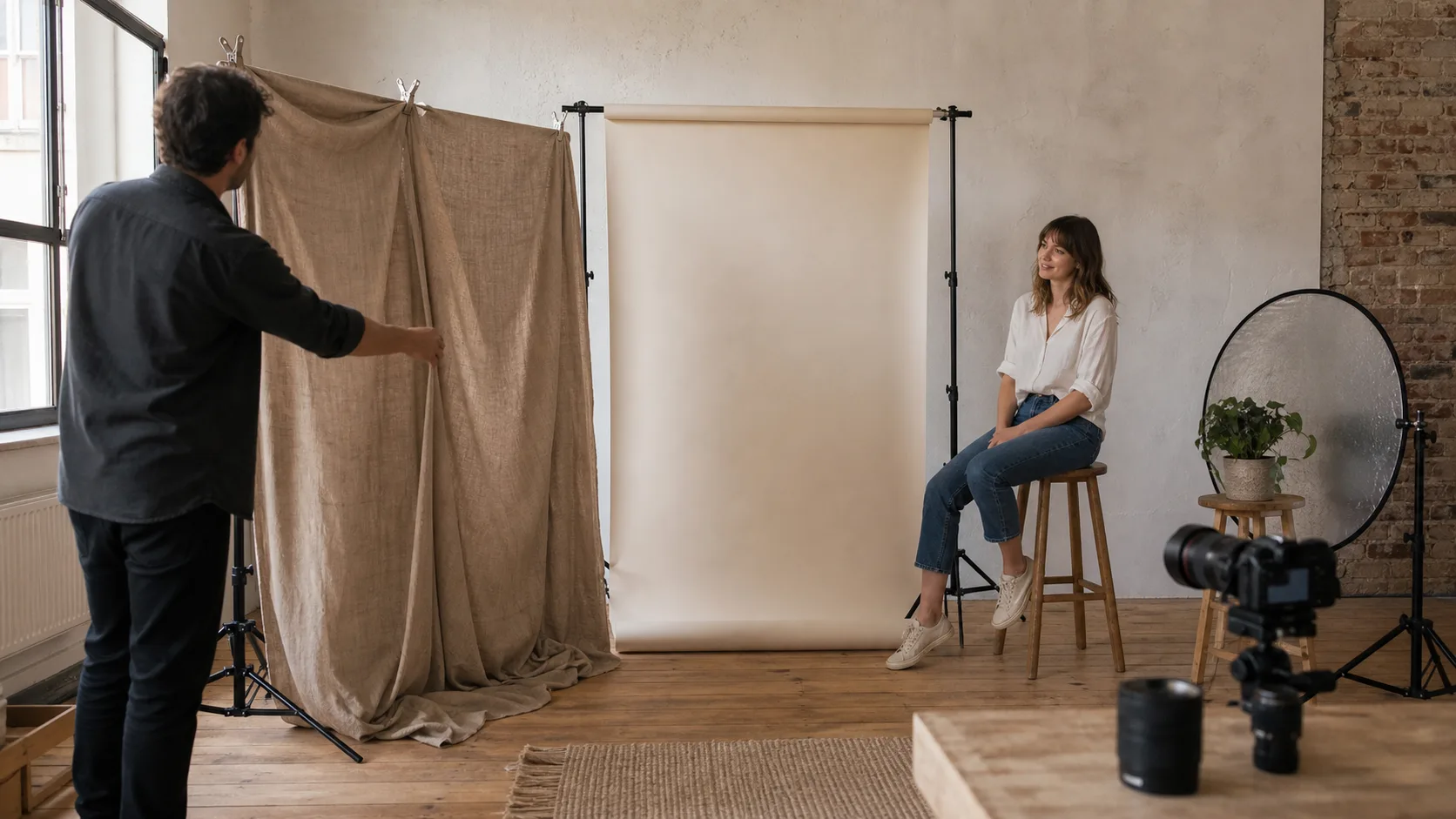 Текстура и линии могут усилить портрет, когда они обрамляют объект, а не борются за внимание.
Фон для портретов на открытом воздухе проще всего сделать, если сначала найти хорошее освещение, а затем выбрать фон. Открытая тень, деревья с подсветкой, тихие стены, затененные улицы, дворы, сады и дверные проемы — все это может работать. Избегайте небезопасных мест, дорог с активным движением, зон с ограниченным доступом, нестабильной местности или мест, где клиент не может расслабиться.
 Фон на открытом воздухе обычно становится лучше, если вы отделите клиента от сцены и упростите свет.
Фоны для интерьера не обязательно должны быть дорогими. Окрашенные стены, шторы, ткань, бумажные фоны, текстурированные углы, оконный свет, офисные помещения и простая мебель — все это подойдет. Бесшовная бумага обычно используется для чистых студийных портретов, муслин или холст могут добавить текстуру, а настоящие комнаты могут добавить контекст, если они аккуратны и актуальны.
Портретный тип | Фоновые идеи | Почему это работает |
|---|---|---|
Профессиональные снимки в голову | Нейтральная стена, бесшовная бумага, мягкий офисный уголок, простая установка освещения из окна. | Удерживает внимание на доверии, выражении и ясности |
Портфолио портретов | Текстурированная стена, стильный уголок студии, тканевый фон, контролируемая сцена на открытом воздухе | Добавляет диапазон, не отвлекая от модели или объекта |
Свадебные портреты | Архитектура помещения, сады, тихий дверной проем, затененная стена, содержательная деталь стойки регистрации. | Соединяет пару с днем, сохраняя при этом их доминирующее положение в кадре. |
Сеансы личного бренда | Рабочее пространство, студия, витрина, чистый стол, детали окружающей среды | Показывает контекст работы клиента, не превращая портрет в экскурсию по помещению. |
Семейные портреты | Открытая тень, простая зелень, домашний уголок, чистый пляж или парковый фон | Ощущается естественно, сохраняя при этом лица читаемыми и связанными |
Ошибка | Почему это отвлекает | Исправить |
|---|---|---|
Яркие пятна за лицом | Зритель смотрит на выделение перед выражением | Измените угол, переместите клиента или выставьте экспозицию и кадрируйте так, чтобы светлый участок находился за пределами важной области. |
Линии через голову или шею | Портрет кажется визуально неуклюжим, даже если поза хорошая. | Переместитесь на шаг влево, вправо, выше или ниже, прежде чем сделать следующий кадр. |
Цвет фона борется с гардеробом | Изображение кажется занятым или непреднамеренным | Выберите более спокойное цветовое соотношение или настройте стиль и обрезку. |
Клиент находится слишком близко к стене | Тени и текстура могут выглядеть резкими или плоскими. | Добавьте расстояние от фона, если позволяет пространство. |
Слишком много контекста | Фон становится объектом, а не человеком | Обрезайте сильнее, упрощайте сцену или оставляйте только детали, которые поддерживают историю. |
После сеанса сравните похожие портреты на предмет выражения, света и четкости фона. Технически четкое изображение все равно может проиграть, если фон будет отвлекать от человека. О соответствующей технике читайтеСоветы по портретной фотосъемке для получения более качественных фотографий клиентов,Лучшие советы по композиции для начинающих фотографов, иЛучшие советы по освещению для фотосъемки на открытом воздухе.
 Качество фона также имеет значение при отборе: выберите портрет, на котором человек, свет и обстановка работают вместе.
Используйте Gampi после редактирования, чтобы окончательные наборы портретов были аккуратными, удобными для просмотра и готовыми к обмену с клиентами или коллегами.
Лучший фон — тот, который поддерживает объект, соответствует цели портрета, работает со светом и гардеробом и не отвлекает от лица, выражения, позы или истории.
Начните с портретной цели, затем проверьте свет, цвет, текстуру, беспорядок, линии, разделение объектов, безопасность, а также то, добавляет ли фон полезный контекст или просто конкурирует с объектом.
Фон становится отвлекающим, когда яркие пятна, беспорядок, высококонтрастные узоры, четкие линии, насыщенные цвета или неуклюжие объекты отвлекают внимание от человека.
Простой фон часто полезен для портретов и редакционных портретов, но он не всегда лучше. Контекстуальный фон может быть сильнее, если местоположение добавляет смысла и при этом сохраняет ясность темы.
Увеличьте расстояние между объектом и фоном, при необходимости используйте более широкую диафрагму, выберите большее фокусное расстояние и подойдите ближе к объекту, сохраняя при этом лицо резким.
Практичный гид по объективам для портретов, свадеб, событий и клиентской съемки с фокусными расстояниями, диафрагмой и crop-сенсорами.
Используйте эти практические советы, чтобы клиент чувствовал себя увереннее, свет был лучше, позы естественнее, а финальные фото чище.
Практичный список свадебных снимков для начинающих с вопросами по планированию, освещением церемонии, портретами, деталями приема, культурной гибкостью и окончательной организацией галереи.