A practical beginner guide to stronger photo composition with subject placement, rule of thirds, lines, frames, negative space, balance, backgrounds, and genre examples.
The best composition tips for beginner photographers are practical: choose a clear subject, simplify the background, place important elements deliberately, use lines and frames to guide the eye, leave space when it supports the story, and review your frame edges before pressing the shutter. Rules like the rule of thirds are useful starting points, not laws that every strong photo must follow.
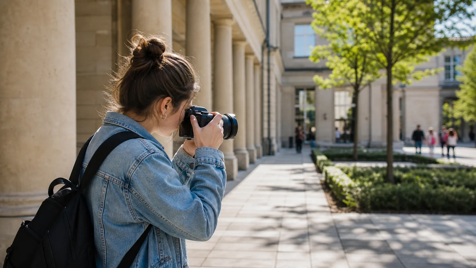
Good composition begins before the shutter: choose the subject, arrange the frame, and remove distractions where you can.
Quick composition checklist
Name the subject before you shoot.
Move your feet until the background supports the subject.
Check all four frame edges for distractions and awkward crops.
Use lines, shapes, light, color, or contrast to guide attention.
Decide whether the subject needs space, symmetry, or a tighter frame.
Take one safe version, then try a stronger angle or crop.
Review similar frames later and keep the one with the clearest story.
Rule of thirds, center composition, and breaking the rule
The rule of thirds means placing important elements away from the exact center, roughly along imaginary thirds of the frame. It often helps beginners avoid static framing, especially for portraits, landscapes, and street scenes. Center composition can be stronger when the subject is symmetrical, direct, quiet, graphic, or emotionally intense. The point is not to obey a grid; it is to make placement feel intentional.
Composition choice
When it helps
Watch for
Rule of thirds
Portraits with looking room, landscapes, street moments, and scenes with clear direction
Leaving too much empty space that does not add meaning
Center composition
Symmetry, direct portraits, minimal scenes, architecture, products, and quiet moments
A frame that feels accidental instead of deliberate
Tight framing
Emotion, details, gestures, and scenes with messy surroundings
Cutting hands, joints, or context that the viewer needs
Wide framing
Environmental portraits, events, weddings, travel, and visual storytelling
A subject that becomes too small or unreadable
Use the rule of thirds as a starting point, then adjust based on gaze, movement, symmetry, and story.
Leading lines, frames within frames, foreground, and background control
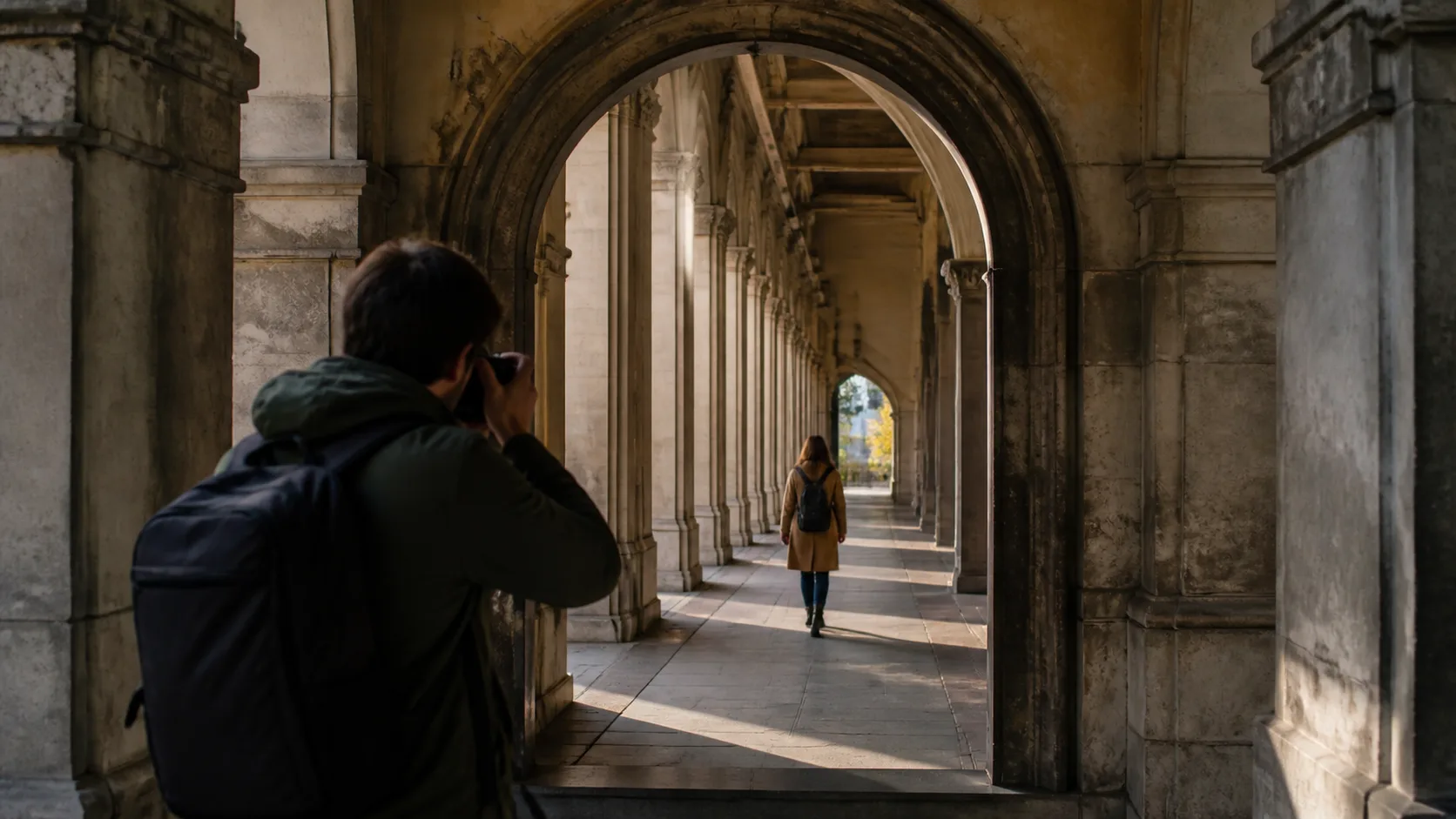
Leading lines are roads, walls, shadows, railings, tables, paths, or architectural edges that pull the viewer toward the subject. Frames within frames use windows, doors, arches, mirrors, branches, or foreground shapes to contain attention. Foreground adds depth, but only when it helps the image. Background control is often the fastest way to improve a photo because even a great subject can get lost in visual clutter.
Choose a background first, then wait for the subject to enter the right part of the frame.
Use doorways, windows, arches, trees, and reflections as natural frames.
Step left, right, higher, or lower before assuming the scene is bad.
Keep bright objects, poles, signs, and hard lines away from heads and faces.
Use foreground gently; a blurred edge can add depth, but a messy foreground can hide the subject.
Look for repeated shapes or lines that make the photo feel organized.
Leading lines and natural frames help the viewer understand where to look first.
Negative space, balance, symmetry, and visual weight
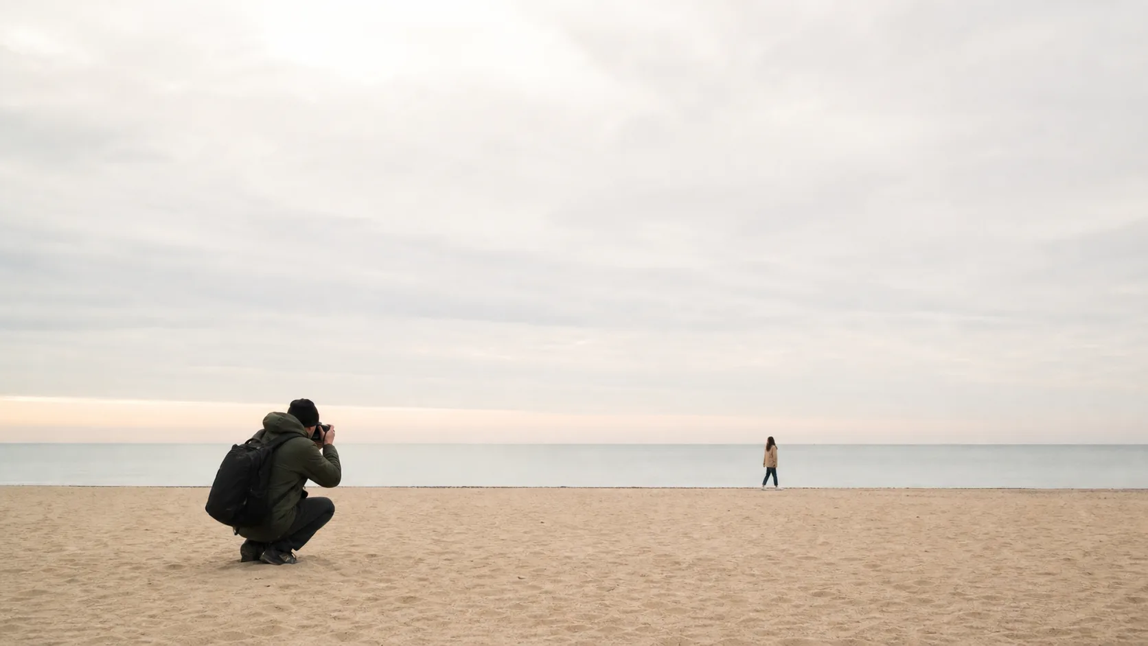
Negative space is the quiet area around the subject. It can make a photo feel calm, lonely, elegant, or graphic. Balance is about how visual weight is distributed: a bright shape, face, red jacket, dark shadow, or large object can pull attention. Symmetry is powerful when the scene already has order, but small asymmetry can make a photo feel more human.
Use negative space when the empty area adds mood or direction, not just because the frame feels unfinished.
Balance a small subject with a large simple shape, shadow, wall, sky, or reflection.
Use symmetry for architecture, couples, groups, products, and calm portraits.
Break symmetry when a gesture, expression, or detail makes the frame more alive.
Watch visual weight: bright areas, faces, hands, and saturated colors usually attract the eye first.
Negative space works when the empty area supports the feeling or direction of the photo.
Composition examples by genre
Genre
Composition move
Why it works
Portraits
Clean the background, leave looking room, and avoid awkward crops through hands or joints
The viewer stays with the face, expression, and body language
Street photography
Choose a background, wait for gesture, and use layers or leading lines
The moment feels observed instead of random
Wedding photos
Use frames within frames, symmetry for ceremony moments, and wider context for story
The image shows both emotion and setting
Events
Build depth with foreground, subject, and background while keeping the key interaction readable
The photo explains what happened without feeling crowded
Products and details
Use simple backgrounds, balanced negative space, and consistent angles
The object looks intentional and easy to inspect
Common beginner composition mistakes and fixes
Mistake
Why it weakens the photo
Simple fix
No clear subject
The viewer does not know where to look first
Decide what the photo is about before shooting
Busy background
Distractions compete with the subject
Move your feet, change height, or use a cleaner angle
Subject too centered by accident
The frame can feel flat or careless
Try rule of thirds, symmetry, or a deliberate centered version
Awkward crops
Cutting through hands, wrists, ankles, or heads can feel uncomfortable
Check frame edges and crop at more natural transition points
Too much empty space
The photo feels unfinished when space has no purpose
Use space for direction, mood, or balance, or move closer
Relying on gear instead of placement
Expensive lenses do not fix weak framing
Change position, background, timing, and distance first
Practice exercises for better composition
Photograph one subject five ways: centered, rule of thirds, tight, wide, and with negative space.
Choose one background and wait for different subjects to enter it.
Make ten photos using only leading lines.
Make ten photos where the background is the main thing you control.
Review a contact sheet and mark why each keeper works: subject, light, line, shape, gesture, color, or story.
Reviewing similar frames teaches composition quickly because you can see what changed when you moved, waited, or cropped.
Use Gampi after editing to organize finished galleries, share final files, and keep the client or viewer handoff simple.
Frequently asked questions
What is composition in photography?
Composition is how the elements inside a photo are arranged. It includes subject placement, background, lines, shapes, balance, spacing, crop, and the way the frame guides attention.
What are the best composition tips for beginners?
Start with a clear subject, simplify the background, check frame edges, use lines or shapes to guide the eye, leave space with purpose, and review similar frames to learn what worked.
How do I make my photos look more professional?
Professional-looking photos usually feel intentional. Clean the background, place the subject deliberately, control light and distractions, avoid awkward crops, and choose the frame that tells the clearest story.
Should beginners always use the rule of thirds?
No. The rule of thirds is a helpful starting point, not a universal law. Center composition, symmetry, tight framing, and negative space can all work when they support the subject and mood.
How do I avoid distracting backgrounds?
Move your position, change height, wait for the background to clear, use a simpler wall or shadow, separate the subject from the background, and check the frame edges before shooting.
A practical guide to using foreground elements for depth, framing, atmosphere, scale, and stronger composition across portraits, travel, street, weddings, events, and landscapes.